
Sketchy section (Public Service website)
UX Tools: Sketch, Illustrator, and Photoshop
Time Frame: 5 Hours
PROJECT BRIEF
I took part in my first hackathon, which was hosted by General Assembly and Socrata at the General Assembly campus in downtown Seattle. We had a team of 2 UX designers (Nathan Langston & myself), 2 developers (Jacob Elder & Alford Northcutt) and 2 data science guys (Fei Wang & Matt Russell).
THE GOAL
The goal was to create a mobile application or a functional site that performed a public service for the city of Seattle that used two Socrata data sets.
From left to right: Alford, Jacob, Nathan, Fei, Matt and Ramon.
RESEARCH
Seattle had nearly 3 inches of snow fall that December morning causing a two hour delay, we had to build this thing in five hours. We spent our first group meeting thinking about what data sets had the largest entries.
Bikes - We could make a topographical map that allows bicyclists to find the flattest (or steepest) routes. Housing - We could find city complaints against landlords to find the most vulnerable pockets of folks in Seattle. Restaurants - We wondered about mapping food deserts. Parking - We thought about using parking data to make an app that displays open spaces in parking garages. Roads - Potholes that are along your commute to work/home. Roommate - Find cool people to live with, that have great credit history and rental history. Accidents - Dangerous intersections around your favorite places to eat, drink, work and live.
Brainstorming for the perfect combination of ideas.
Our data science guys Fei and Matt looked at the data for all of these categories, after which as a team we felt that Potholes and Traffic Collisions had the largest data sets available. We decided on creating a website that would give you the history of an intersection and along with current road condition.
We settled on creating a website that calculated the number of car accidents that happened in any given intersection in Seattle. We called it Sketchy Section.
Since we only had 5 hours we decided that we would focus on a website. Nathan did a quick survey of 30 people in the room and 97% of them knew of an intersection in Seattle that was dangerous.
Some of people offered up examples of six-way merges and grizzly stories of cars crushed. One person said she had seen three accidents with her own eyes. But when asked if she knew how many accidents had actually occurred in that sketchy intersection, she had no idea, along with everyone we had asked.
We asked how you would find that information if you needed it. Some of people said they would Google it but our team tried that and came up empty over and over.
Some of the people from the surveys said they would count the crosses and wreaths and white bicycles. A few thought you could look up the stats on SDOT, which bewilderingly does not provide any of this information.
DESIGN/PROTOTYPING
Seattle had nearly
All of the research went into a single and simple persona that accurately represents the larger Lulabop base.
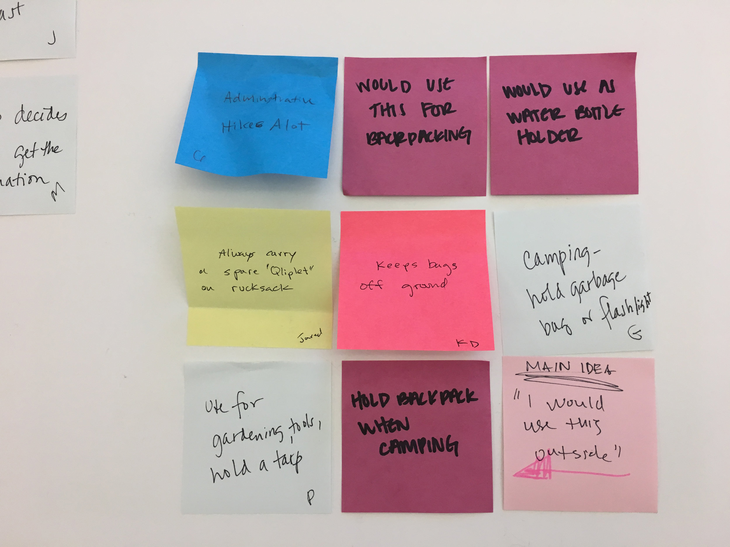
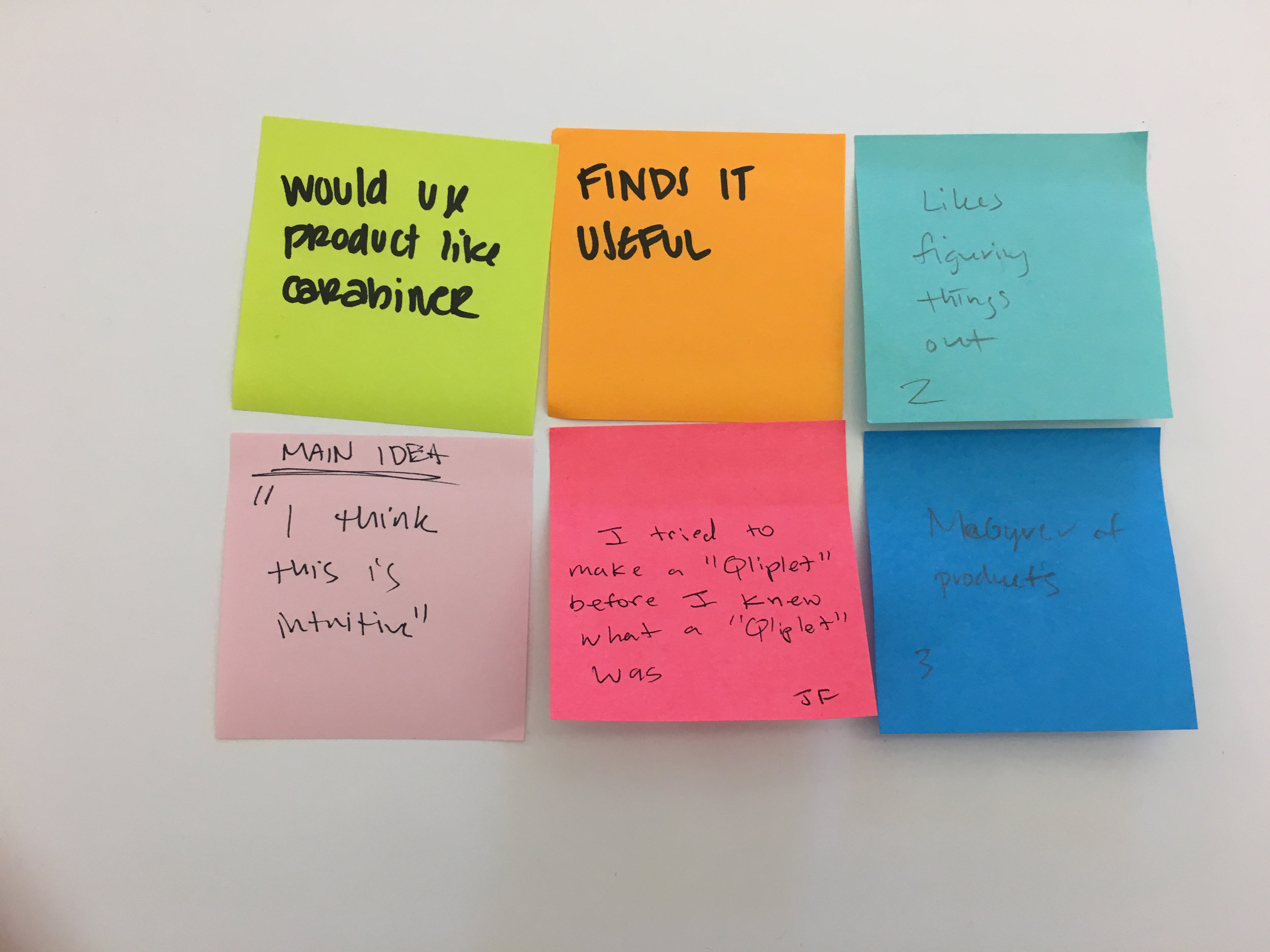
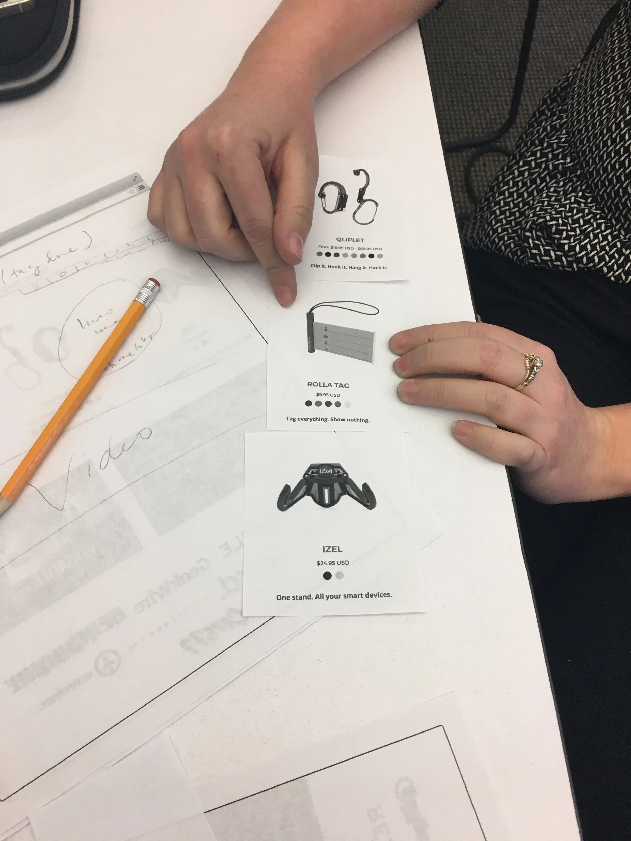
Along with the Persona, a user journey was created from user stories using the Qliplet (Hero Clip)
1. Bob loves taking his kid on weekend adventures around town. He needs to pack enough gear for his son to be entertained along with carrying a coat or extra pair of clothes in case there is bad weather or an accident.
2. Recently Bob has been trying to modify his stroller to accommodate all the extra gear. Bob has been using his DIY skills to modify his stroller. By drilling holes into the cup holder of the stroller so that he can attach a homemade hook to carry his extra bags.
3. Unfortunately these homemade hooks fell apart on his last trip to the Zoo with his son. The concept of hooking bags to the stroller worked, but needs to be something that isn’t drilled into the stroller.
4. Looking at DIY sites and researching clips online, he finds a Hero Clip (Qliplet). This gives Bob the same clipping features of regular carabineers, and the DIY hooks he was using before. The Hero Clip (Qliplet) lets him also unhook his diaper bag from the stroller that can then be used in the men’s room to keep the bag within reach while he changes diapers.
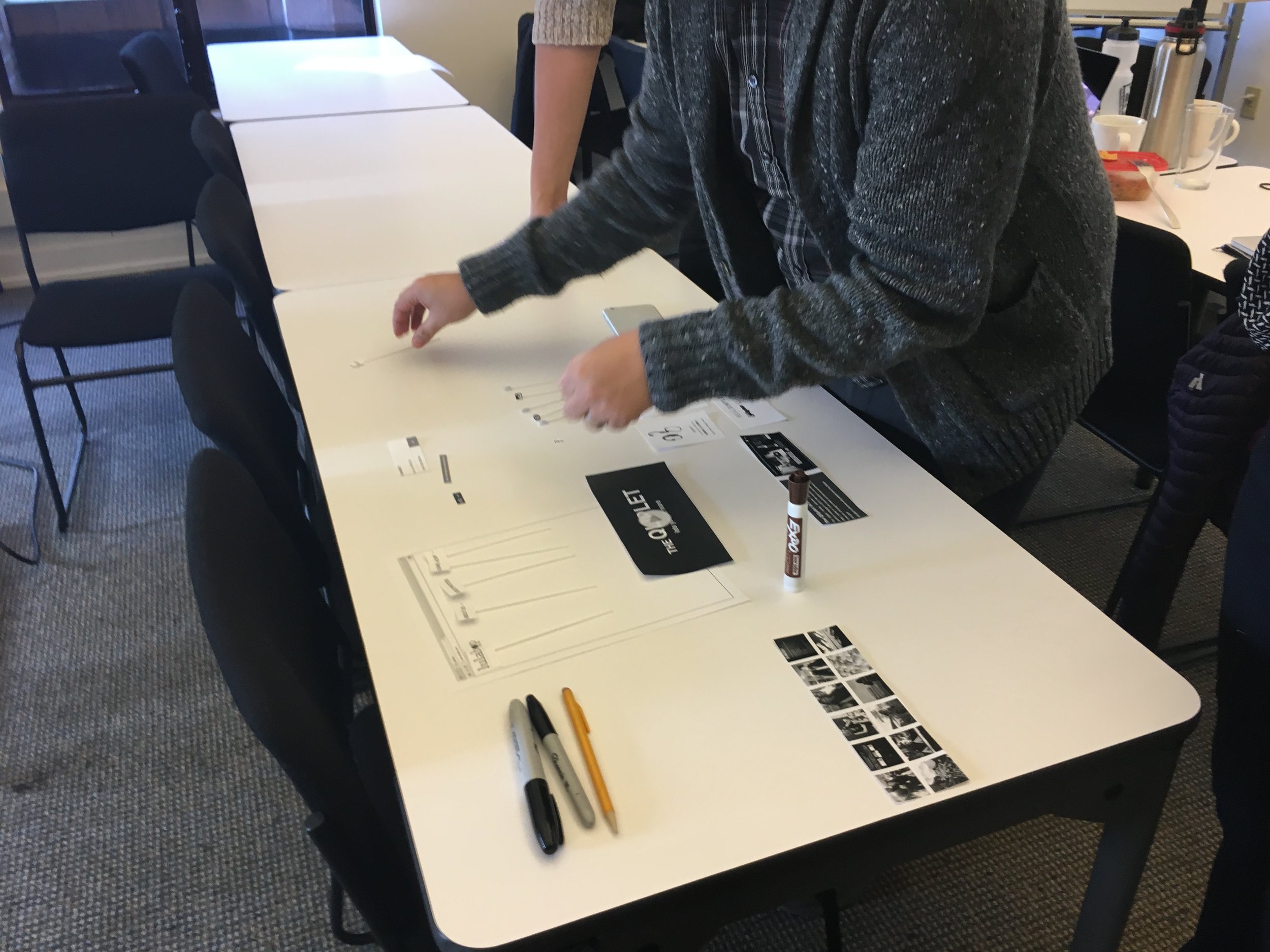
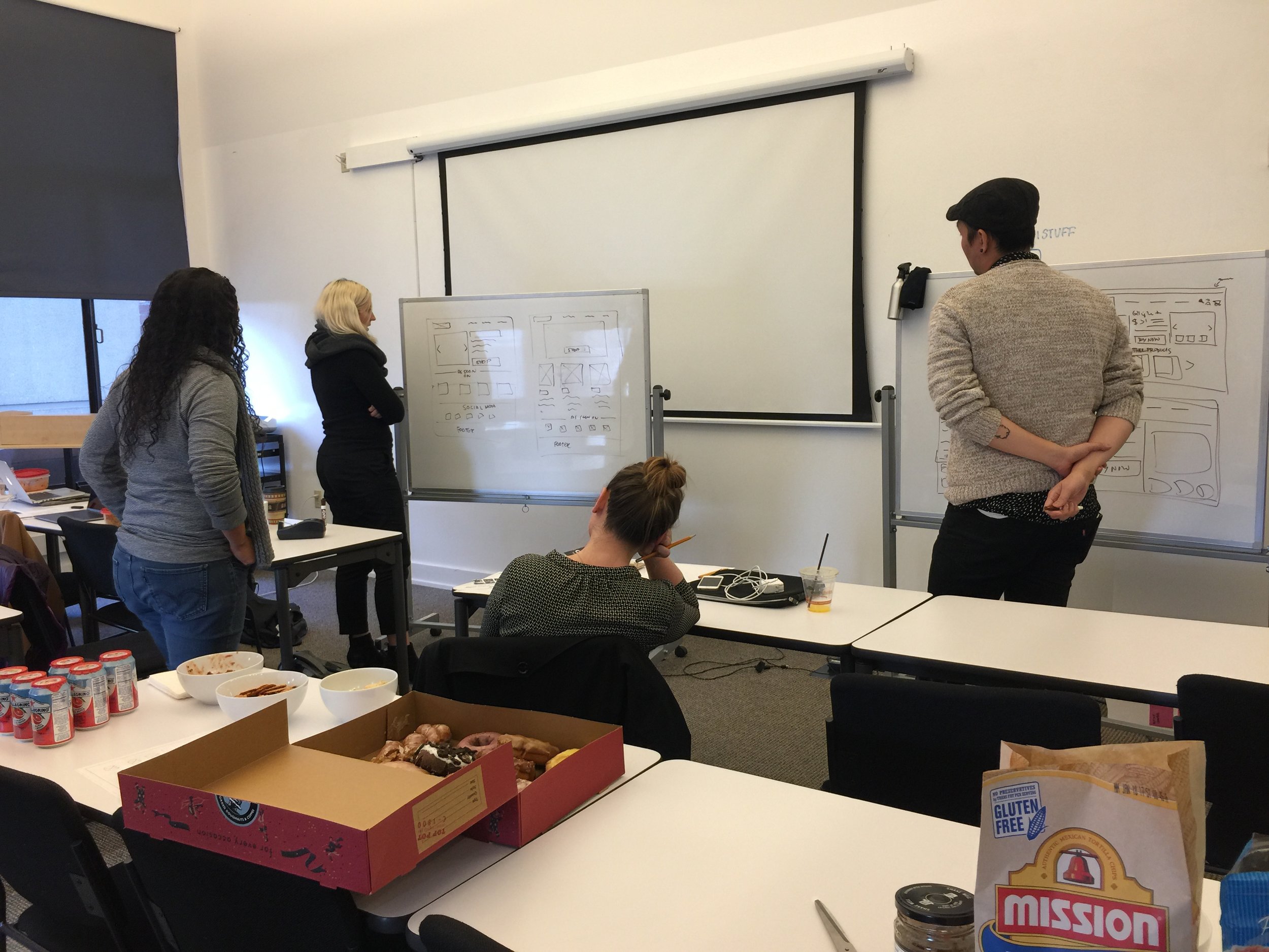
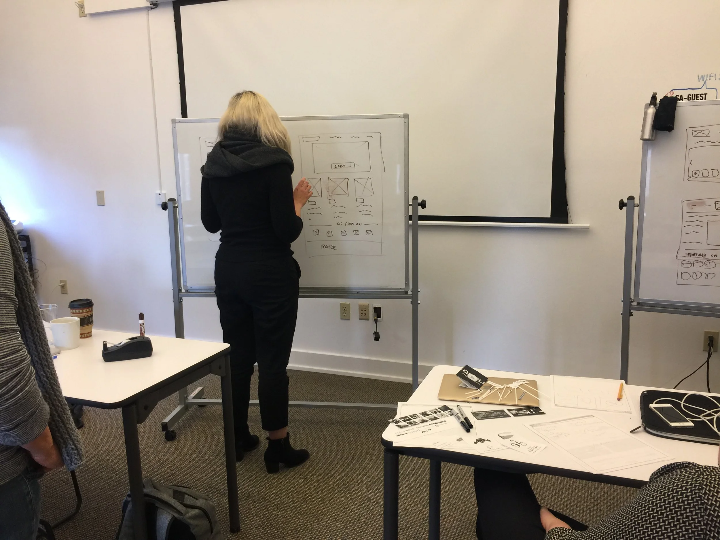
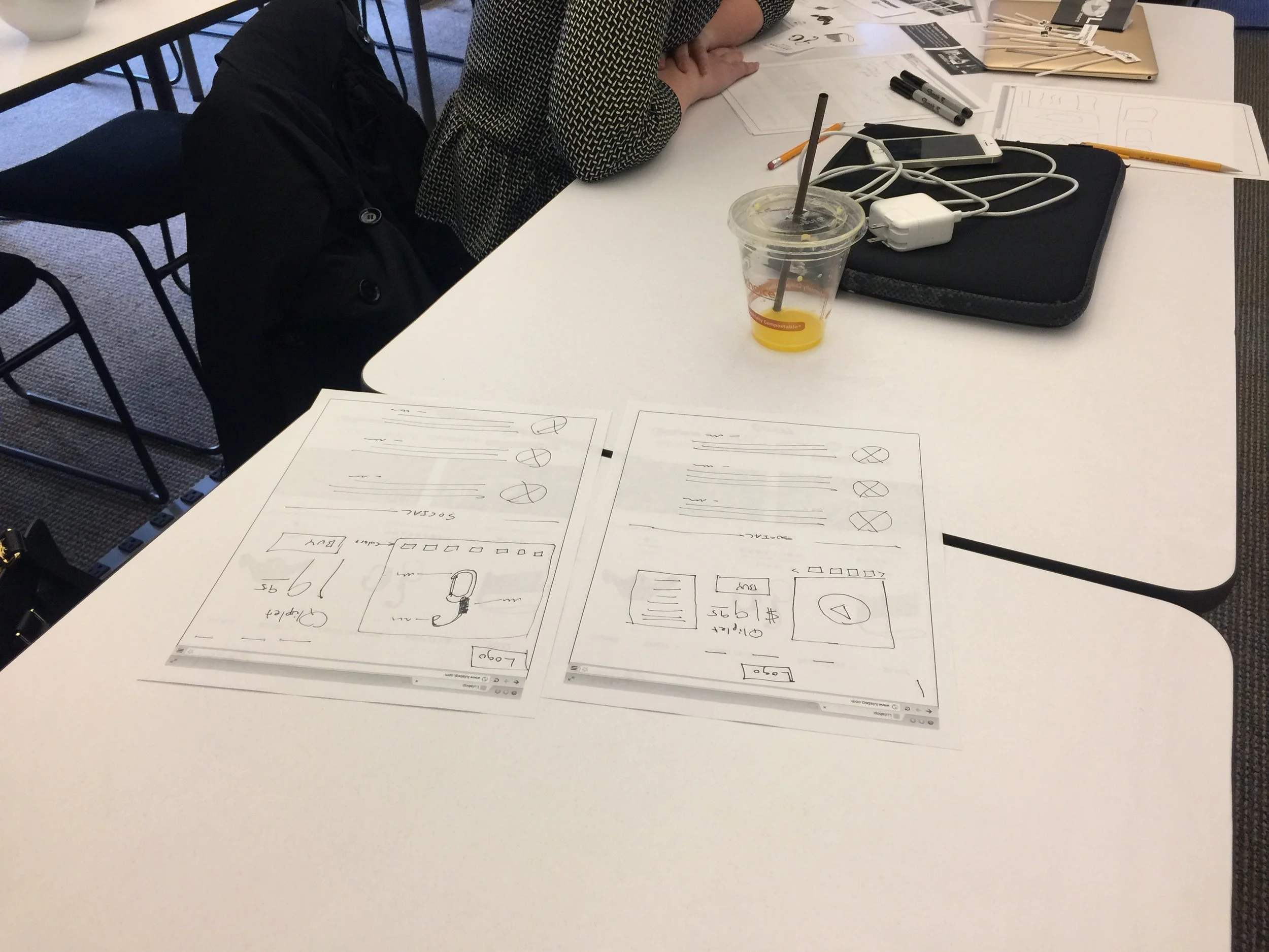
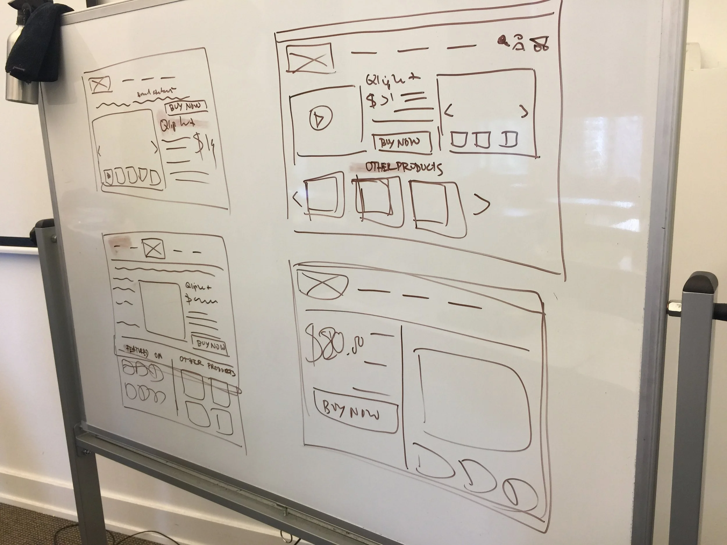
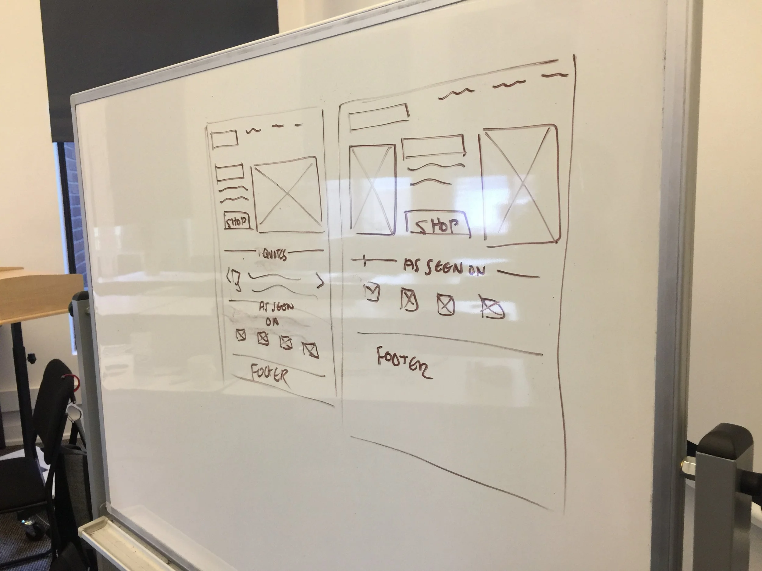
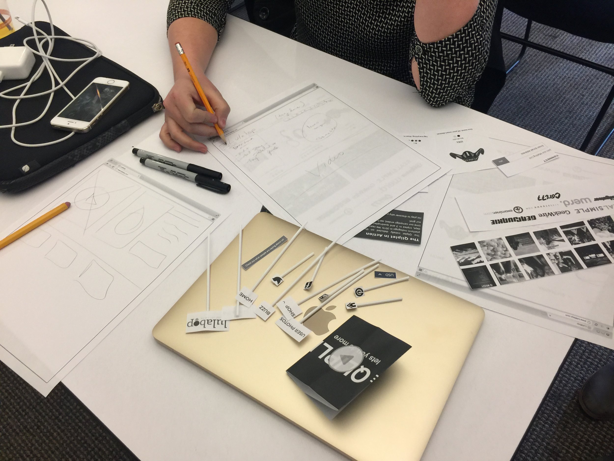
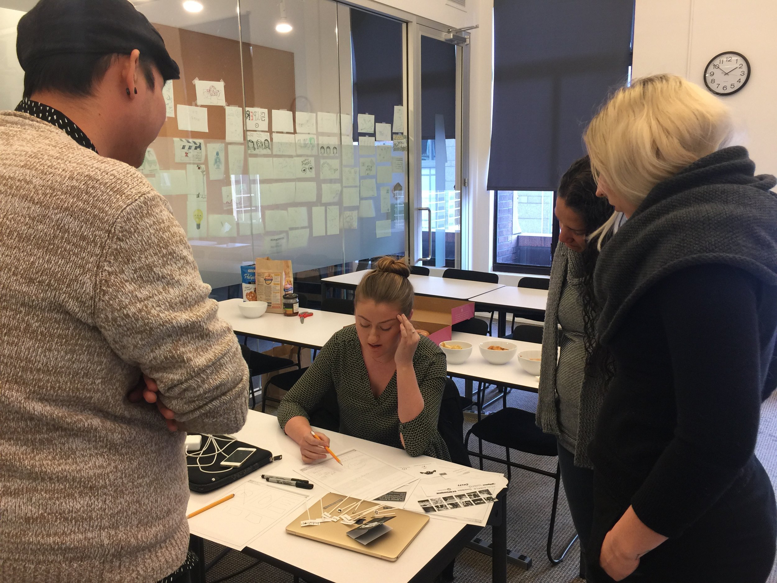
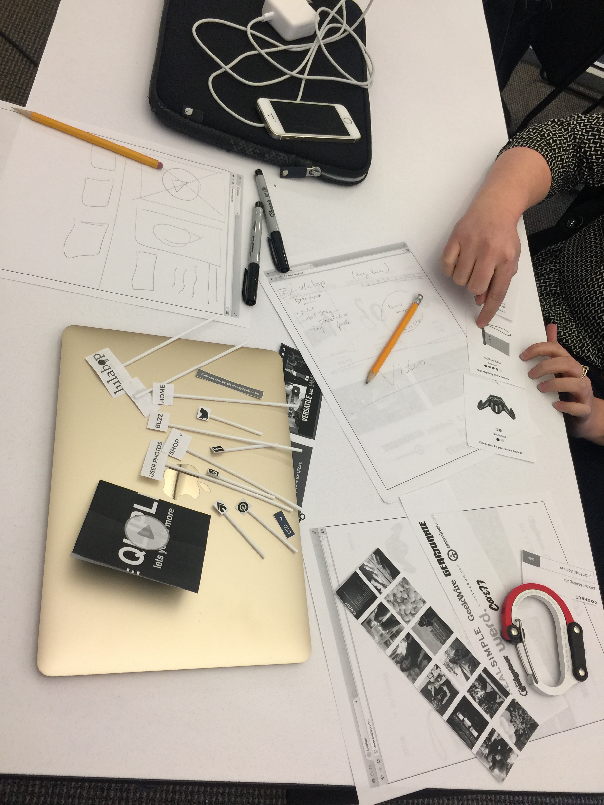
SKETCHING /PROTOTYPING
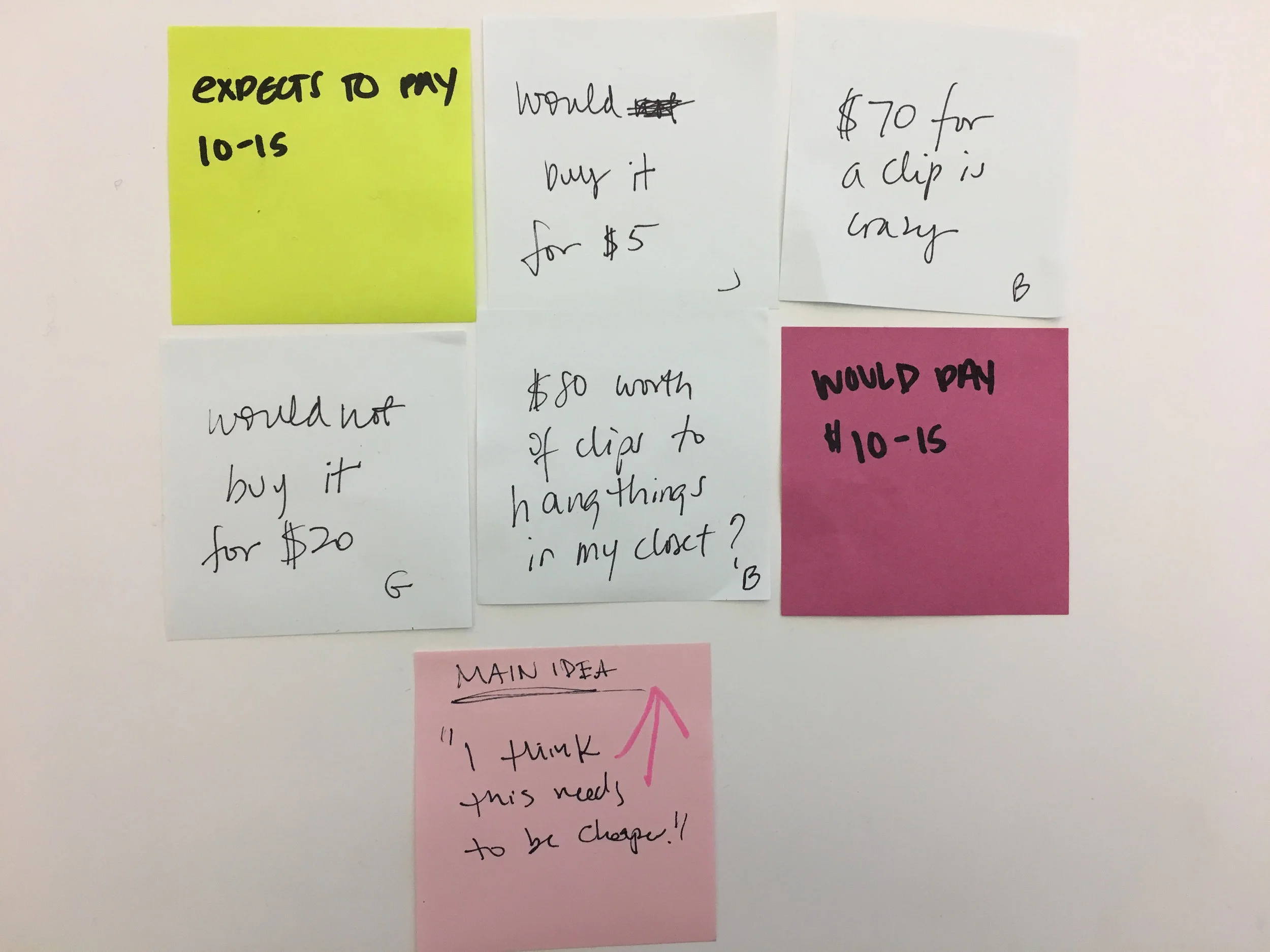
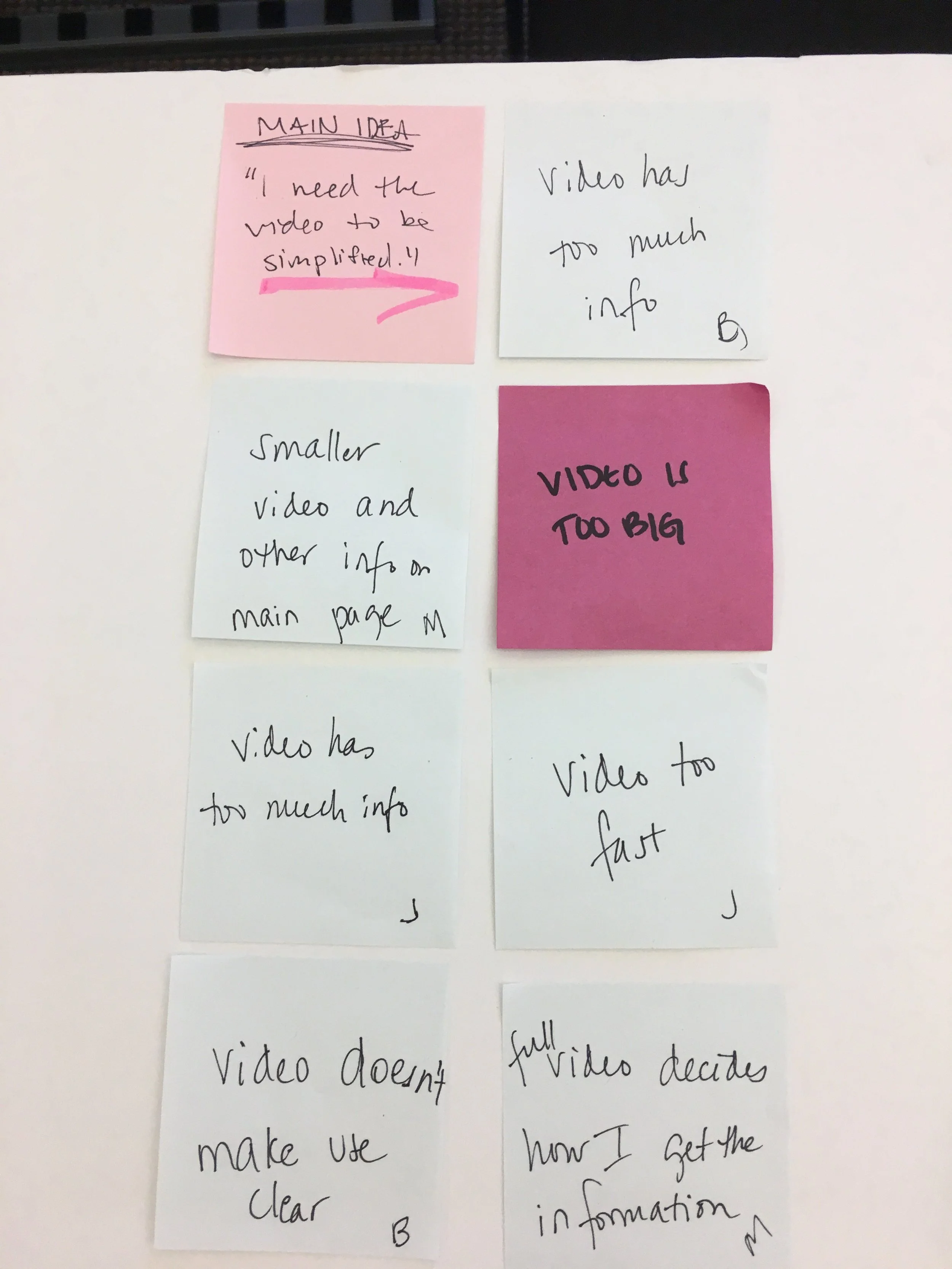
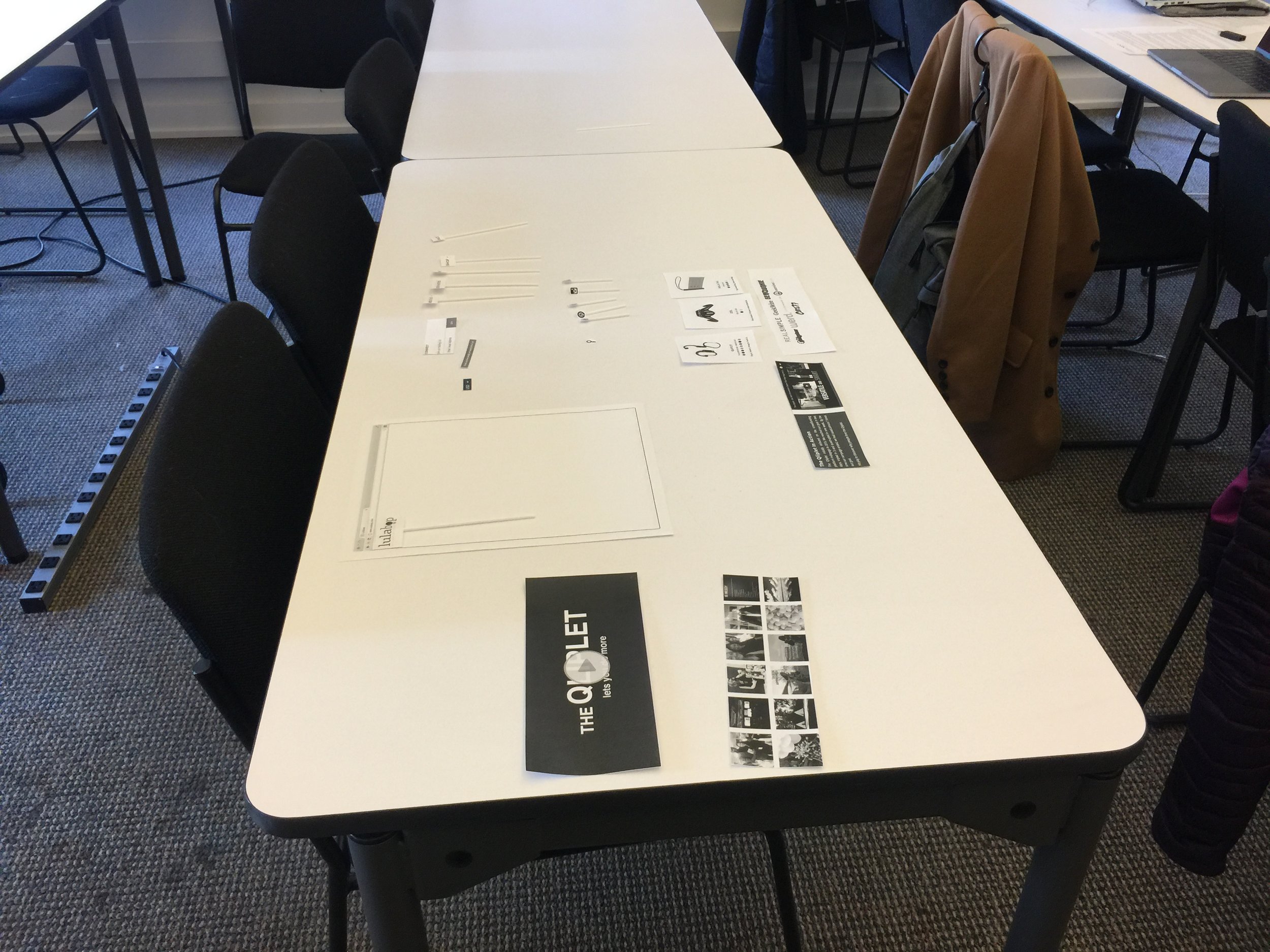
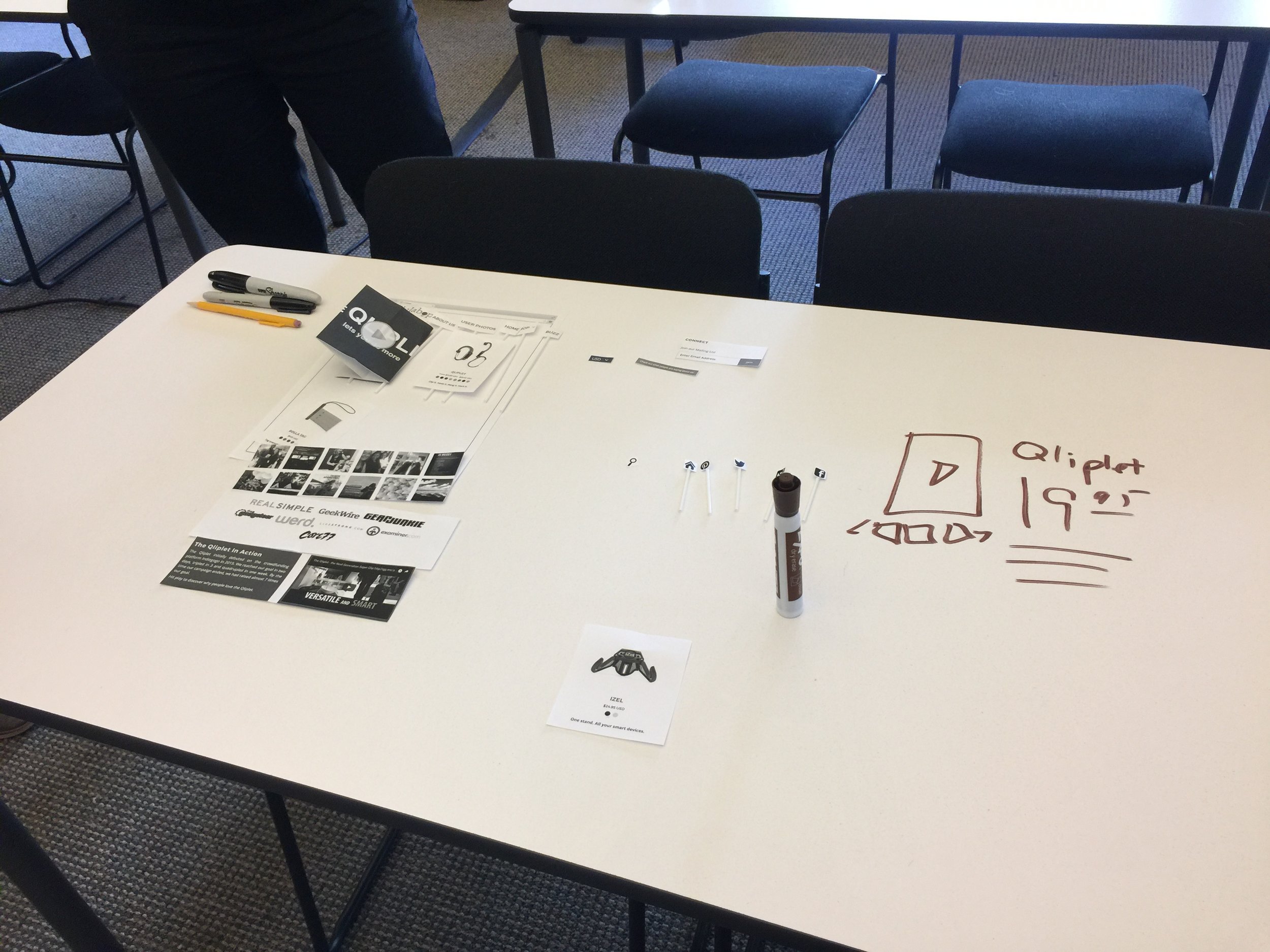
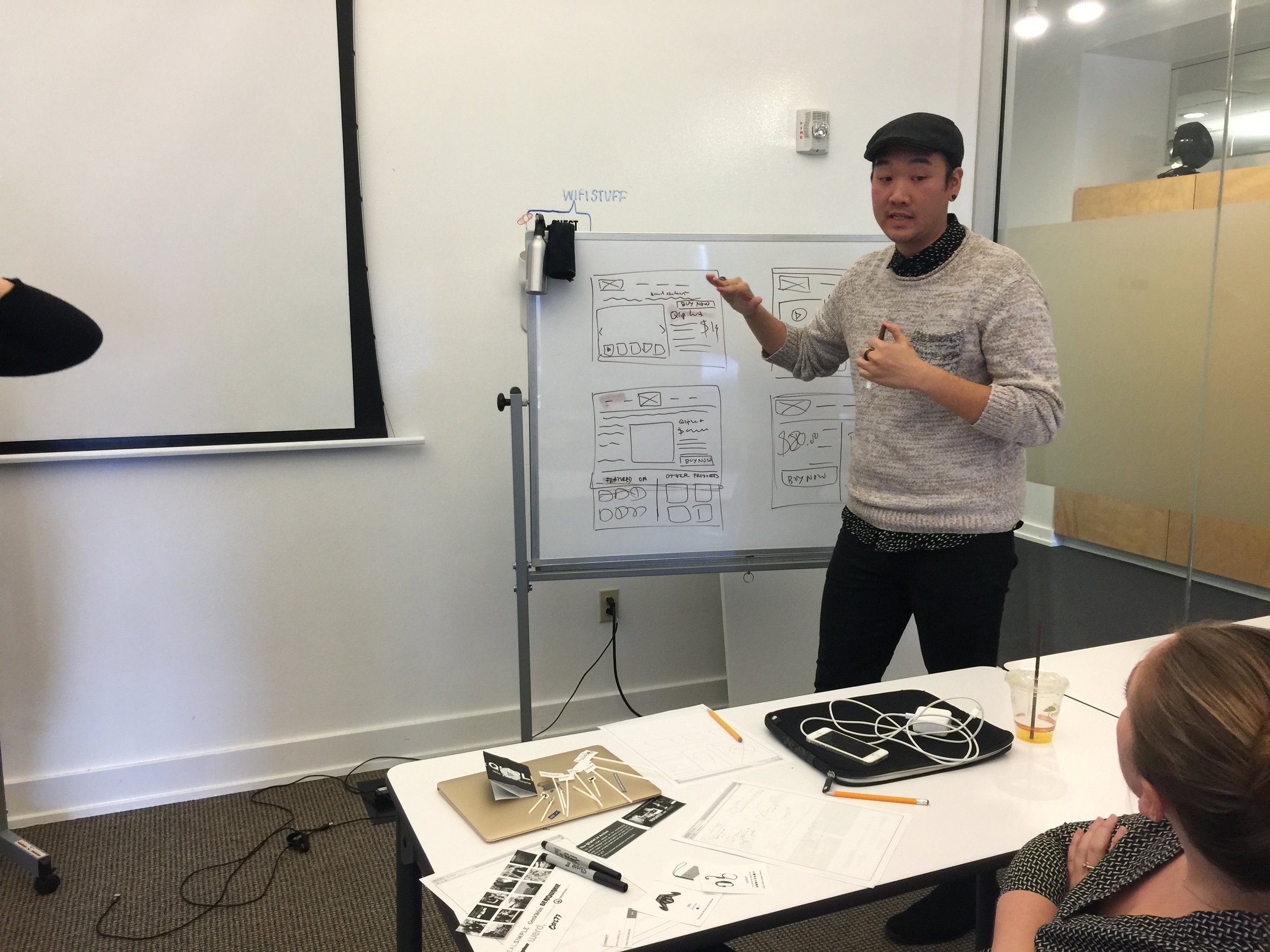
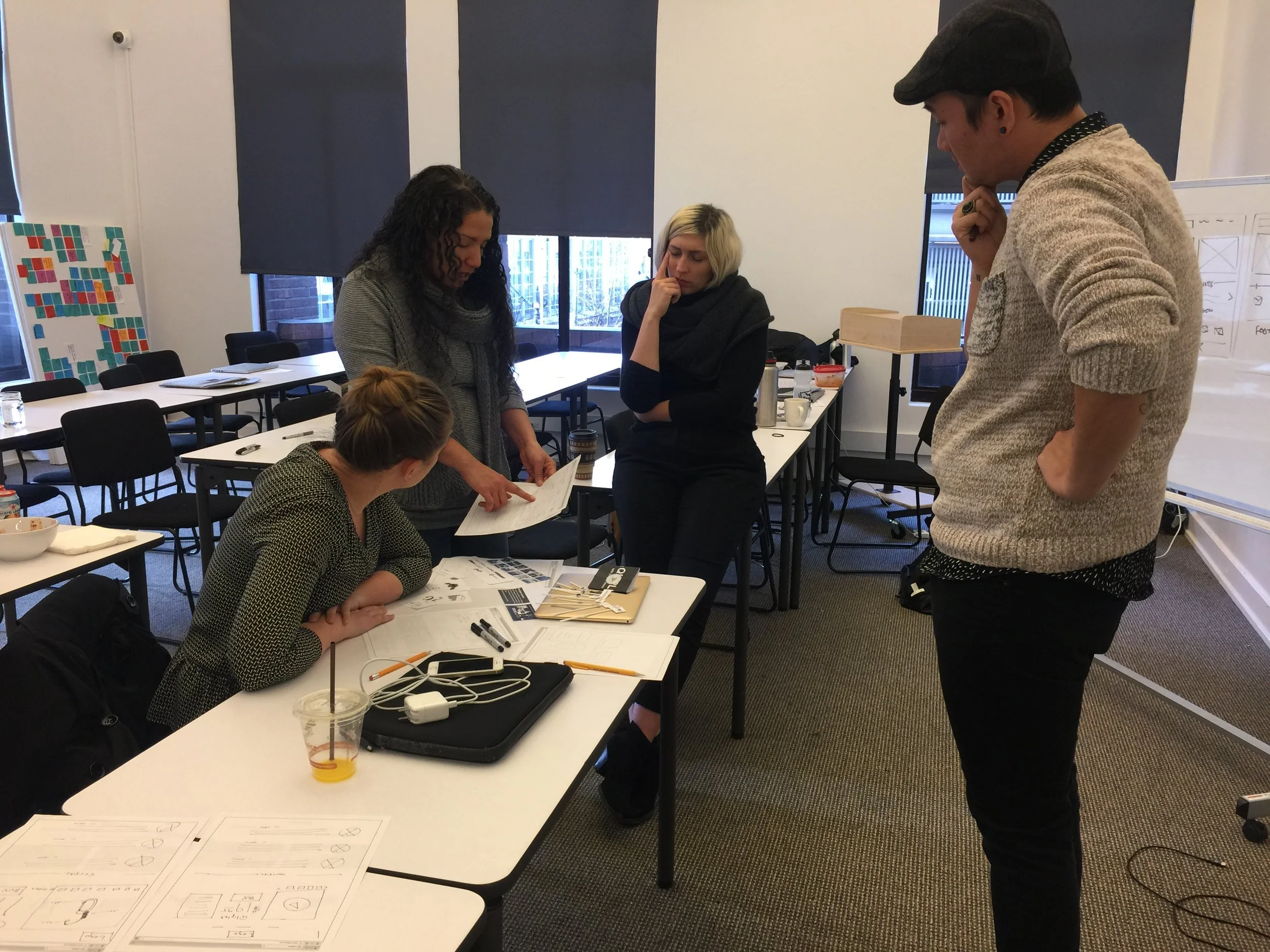
With the research complete the next step is to white board and sketch out ideas. These ideas were present to the steak holder at a mid-project meeting. With the clients input we presented Paper Prototypes that could be iterated upon quickly. Also at this meeting, the client was presented with the pain points discovered in the research. Lulabop had been in the process of updating the brand, with our input it seemed like a good time to push through with some of these updates. The Qliplet was renamed the Hero Clip and the company colors changed from Grey/Blue/Red to a forest green and the font in the logo became more modern. Lulabop was hesitant to update all the content on the home page. They felt the video really conveyed their products well. Incremental steps, the feeling was to show them a high fidelity mock-up of the paper prototypes that had been created at the final steak holder meeting.
A/B TESTING
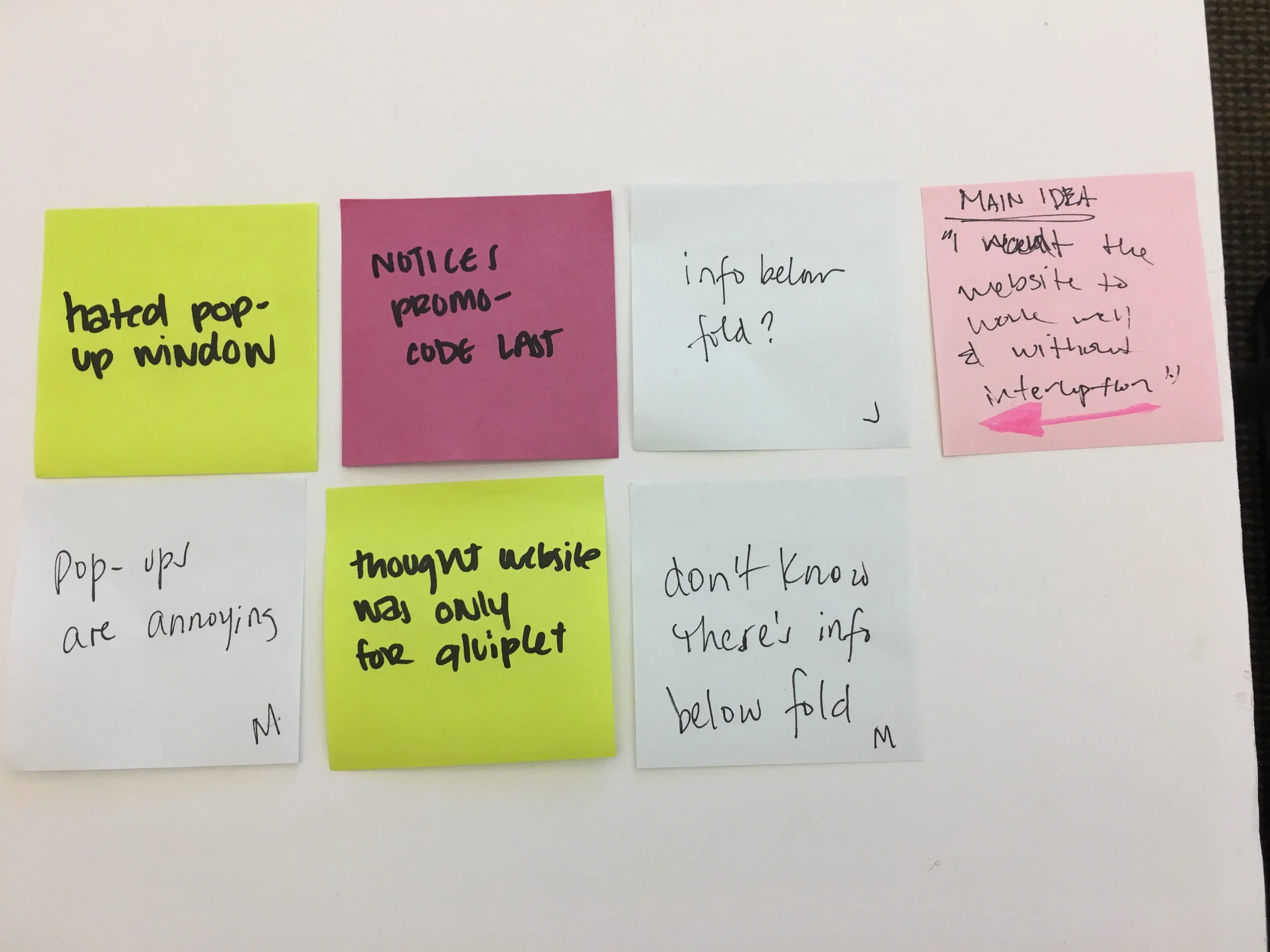
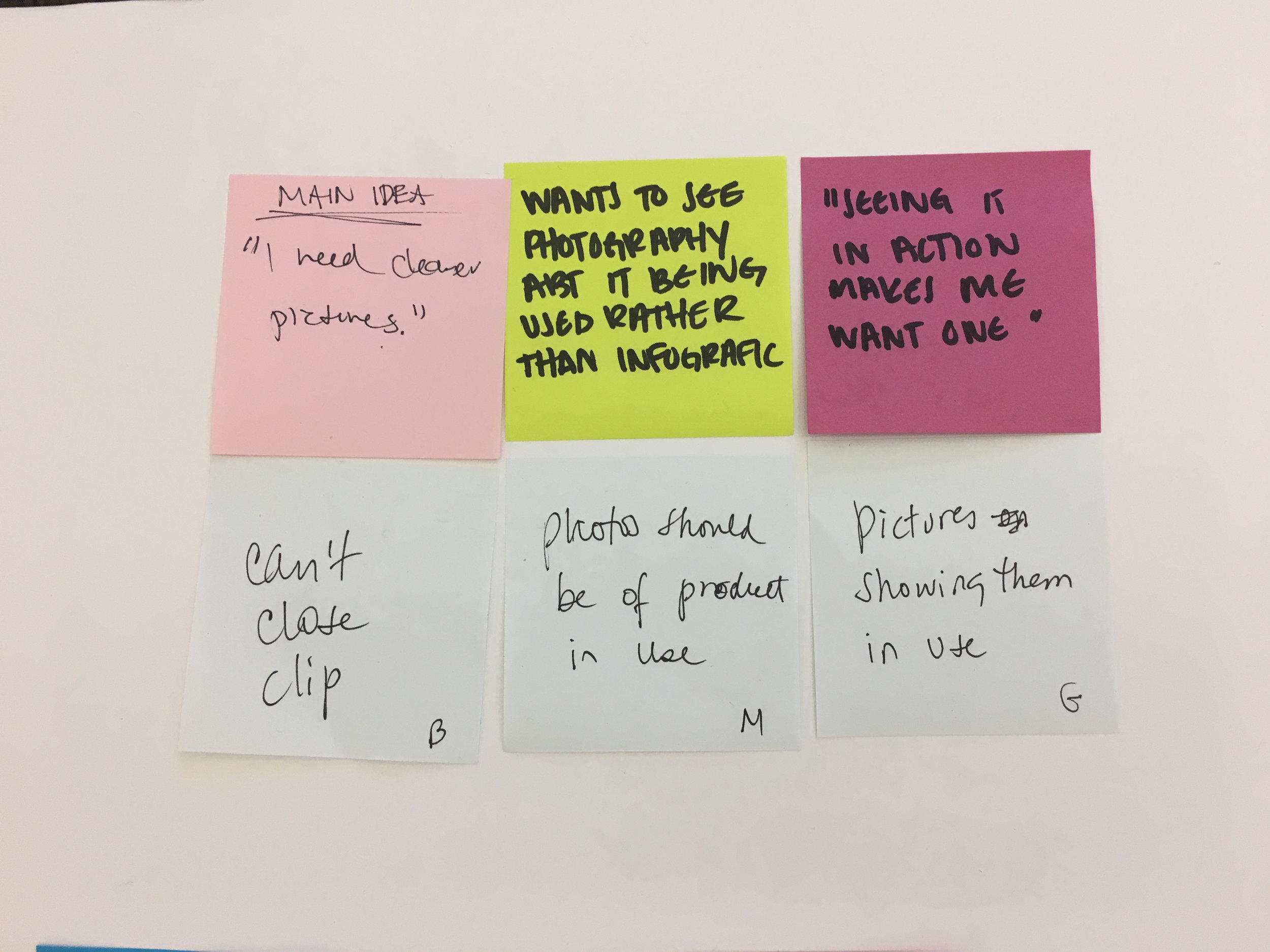
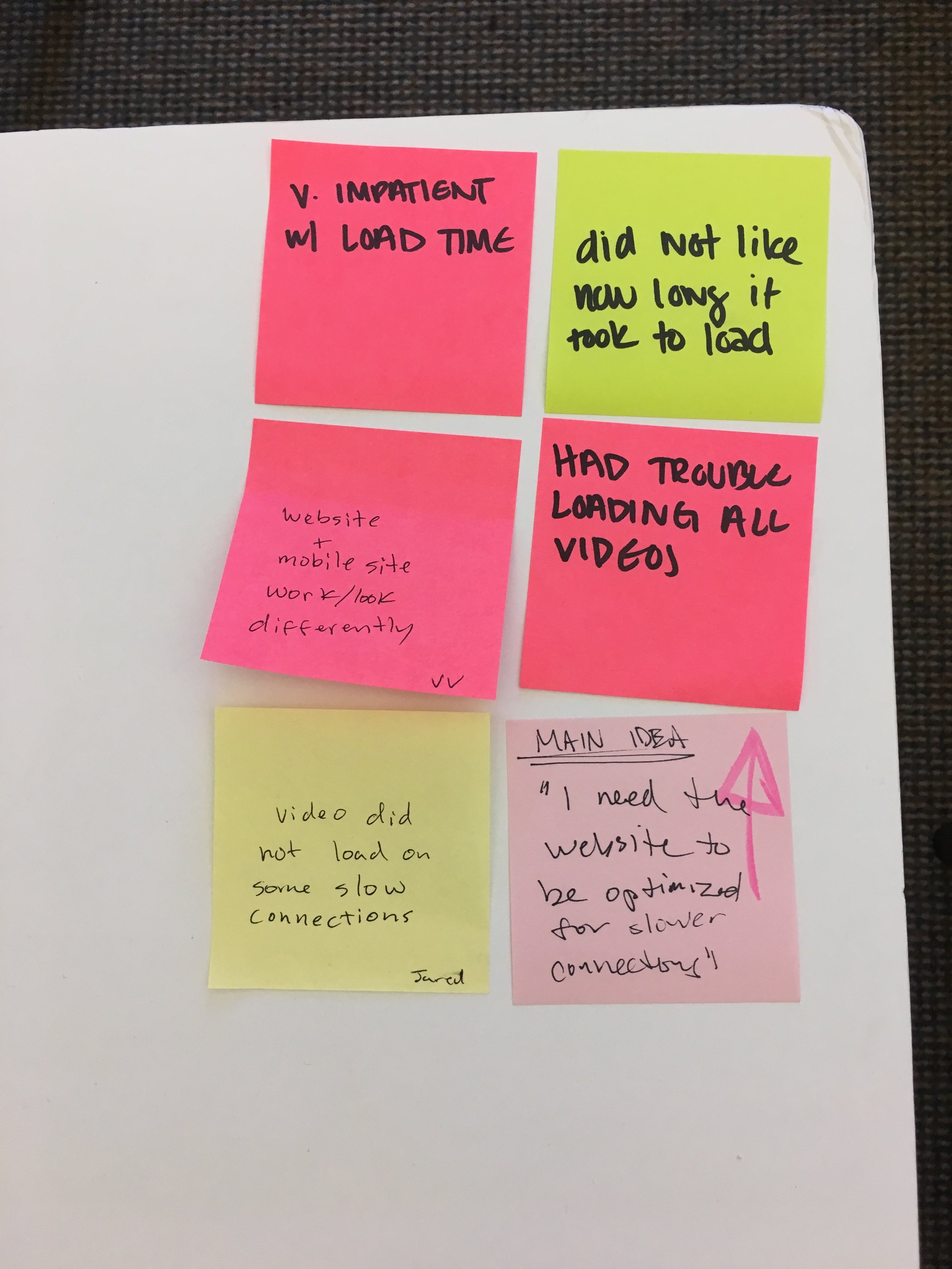
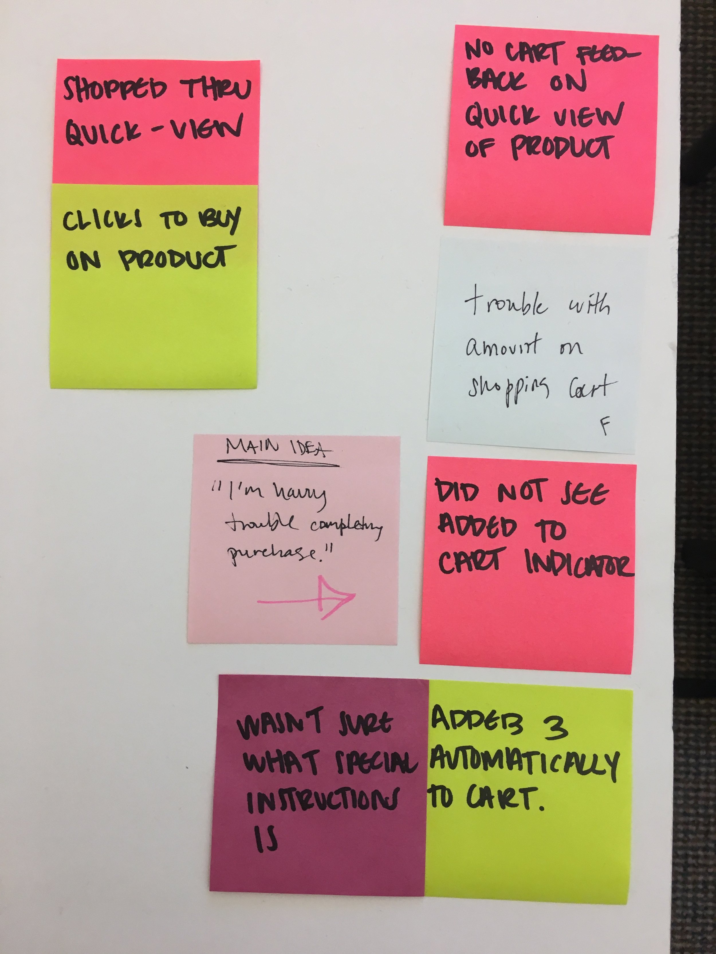
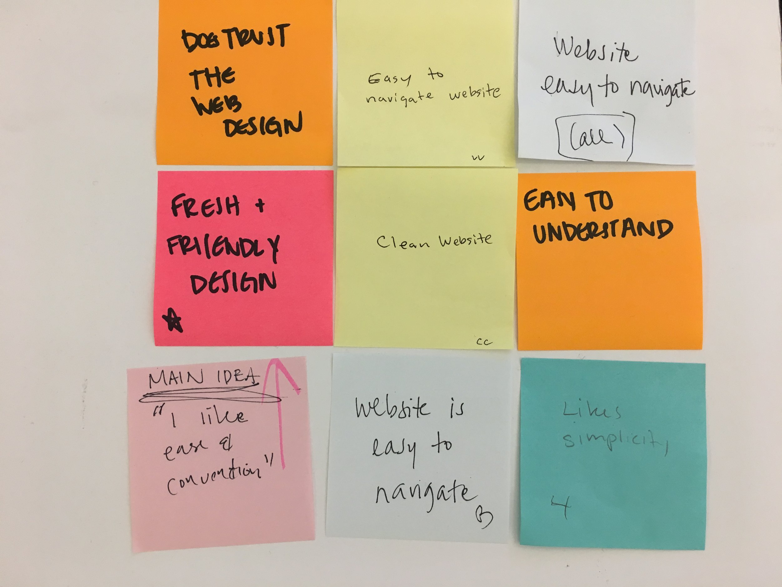
The high fidelity mock-up of the landing pages was changed to a carousel that displays images with the product detail and the product in use, the research indicated that 7 out of 8 testers preferred the photos over the video. This would also solve the problem of customers with spotty internet connections not being able to load the video.
Feedback about the order in which the images of the product detail and the product in use should be displayed was divided half and half: Some preferred to see the product first because it creates interest and later found out about its practical uses. The other half would rather see the use first and then have a closer look of the product.
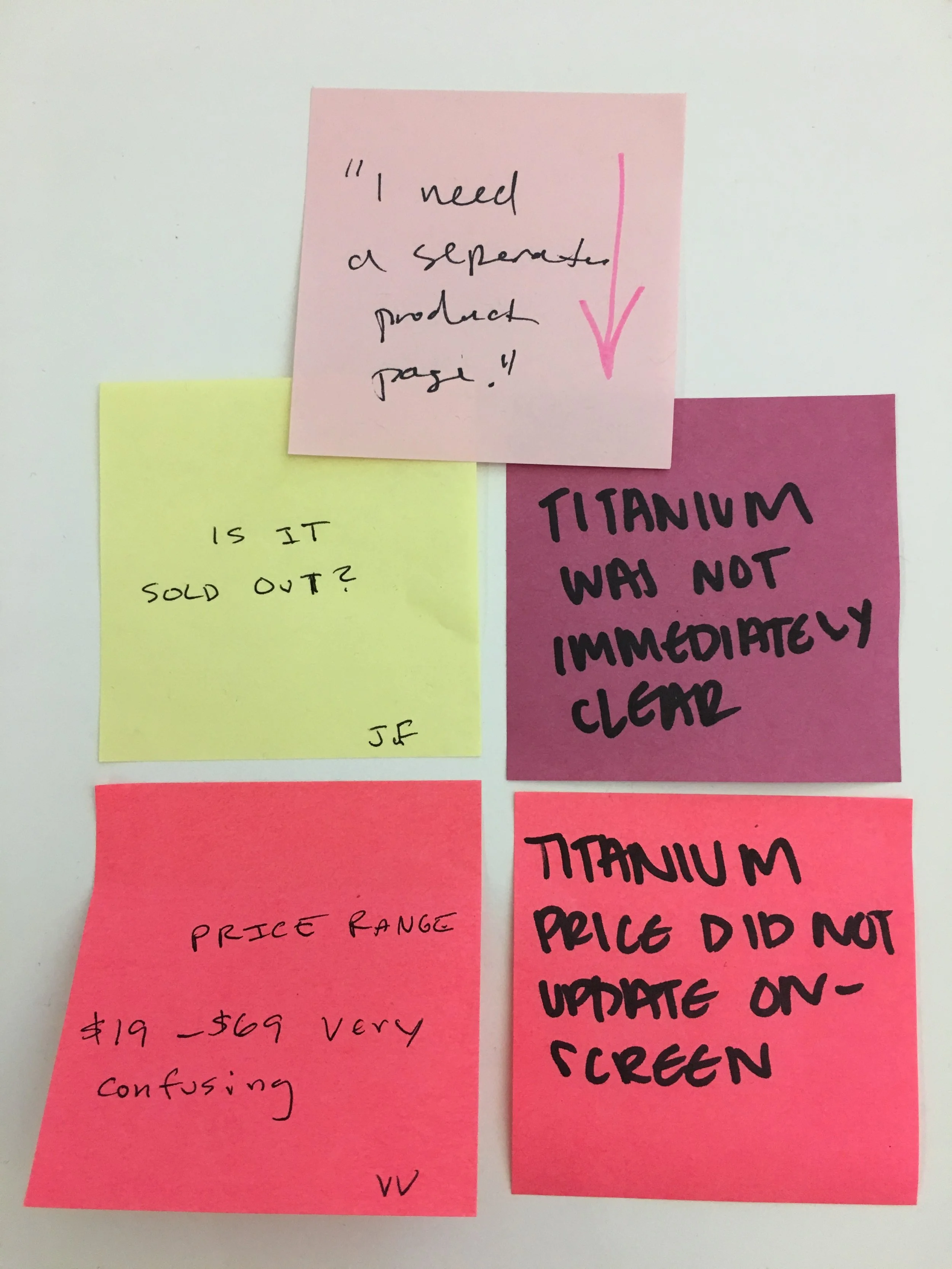
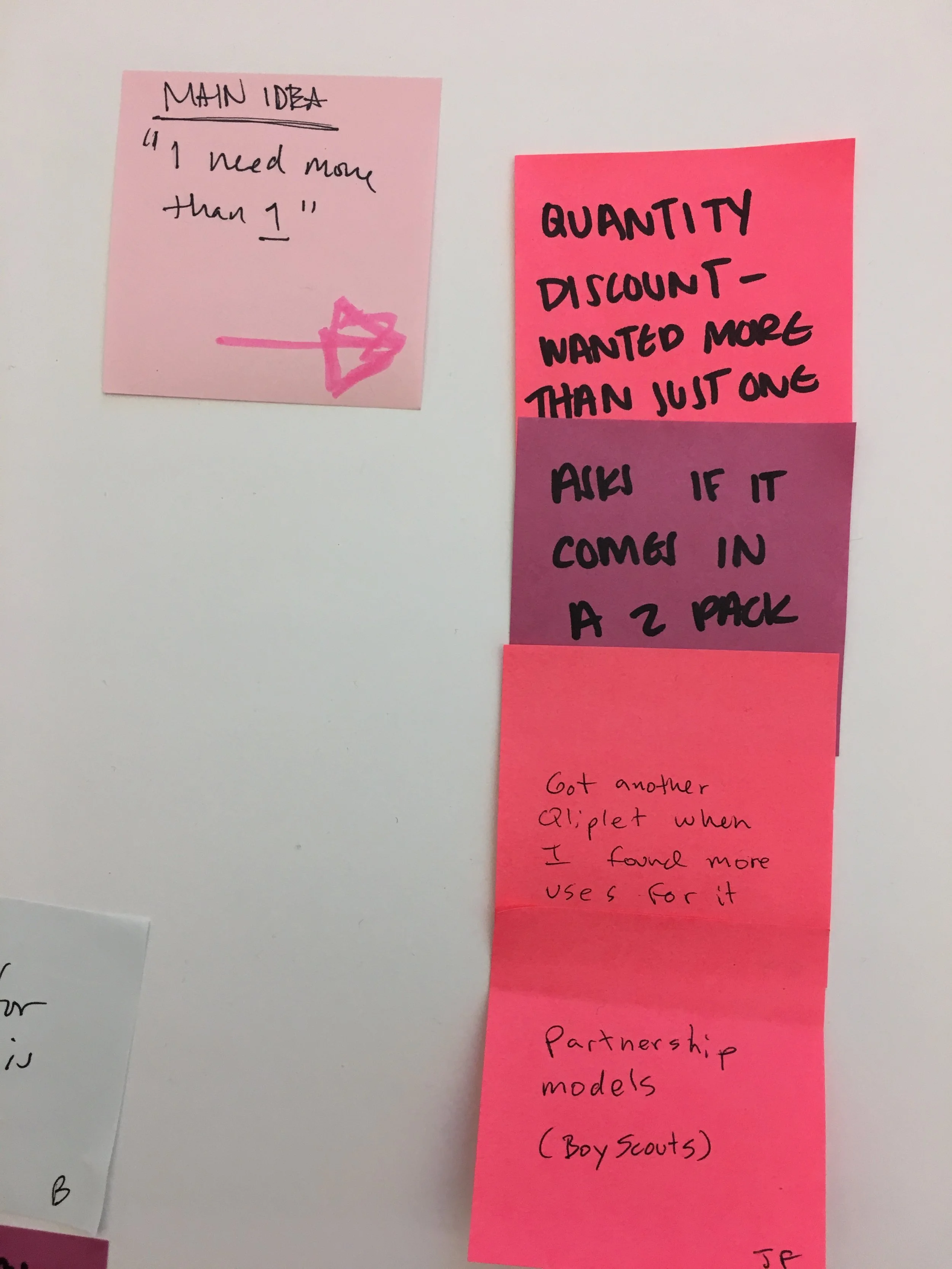
Midway through the project, the name of your product Qliplet, changed to Hero Clip. This change came at the perfect time, customers were consistently confused with the Qliplet and Qlipter. Although, the name change would need to wait until the second quarter of 2017, still good news.
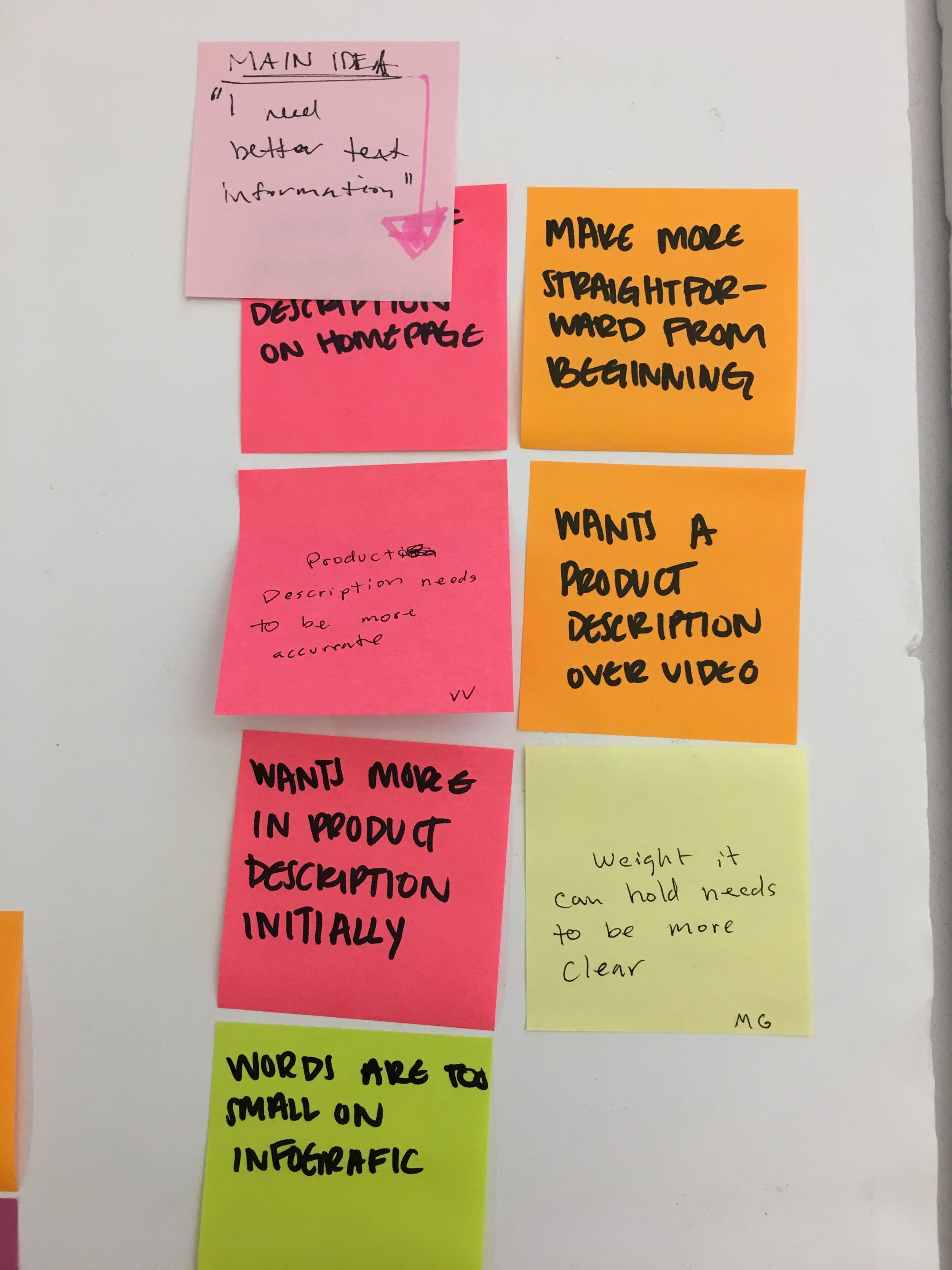
With this mock-up, the video is now gone and instead you get a carousel of products. This enables the mobile and desktop site to load quickly for the user.
The navigation bar was condensed down to; Shop, About Us, Testimonials and Sale. The feedback from the interviews indicated the customer would expect to see user photos in the Testimonials rather than in the Shopping page or in a random place on the Home screen.
Another mock-up was made for the carousel to use video that the user would be able to play at their discretion. This would solve the client’s hesitation of moving away from the video and making the site load more efficiently.
VALIDATION/PITCH
At the final Pitch with all our A/B testing concluded, a Shopify mock-up was presented to Mina Moo and Ciara Duff. The presentation laid out the research showing the case to replace the video on the home page along with placing a “shop now” call to action button on a carousel of images. These two updates created a clear path to the purchase of the product. And with the video replaced with an image carousel, the mobile version of Lulabop.com would become more efficient, along with delivering a consistent experience between desktop and mobile.
At the conclusion of the Pitch, Mina Moo the founder of Lulabop, expressed that she had initial concerns about the changes from the mid-project meeting. But with the final A/B testing research, Mina was ready to implement nearly all of the updates shown. The only revision not made was the name update to the Qliplet. Lulabop is currently waiting until the second quarter of 2017 to update the name to Hero Clip.
This was a great project to work on, nothing beats having a very happy client. I’ll keep updating on the impact the updates had on Lulabop.com in the future.